|
|
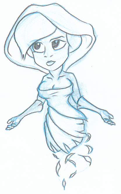
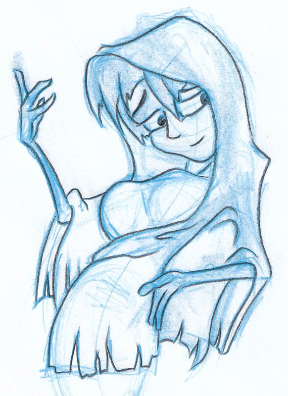
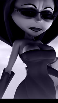
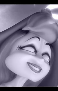
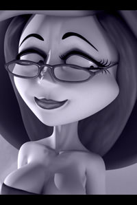
Death
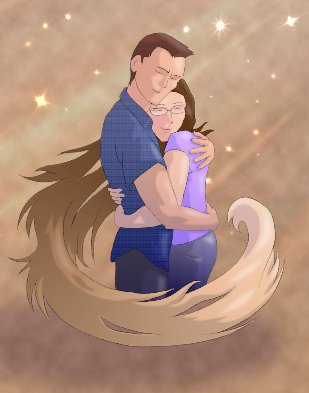
Death was a character for my CG Short Film and ends up being the love interest for both Cupid and Devil. She started out as a secondary character relative to them but she holds her ground firmly and won't take any of their mischief. As the film evolved, she became a very popular character and her role grew, but I would still like to have done more with her to expand on her role in the film. |
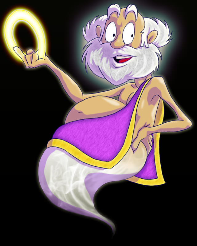
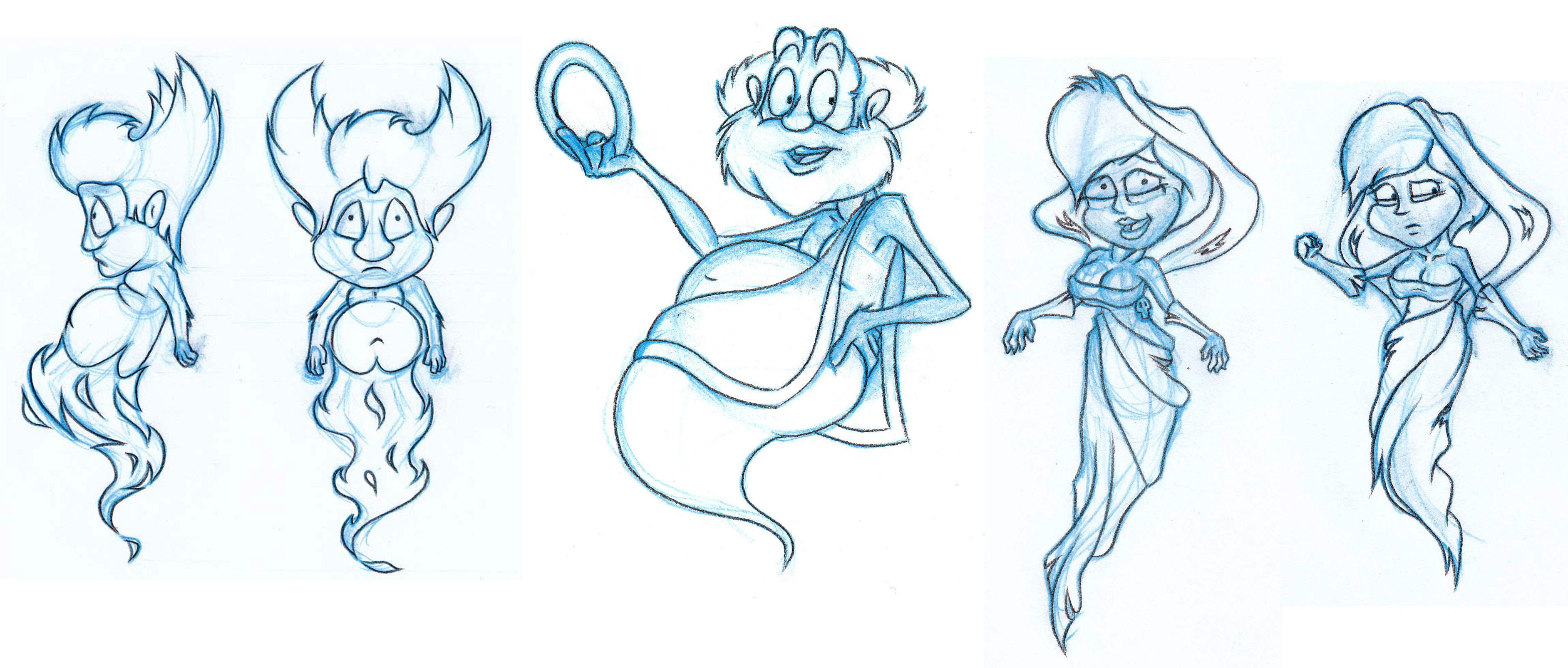
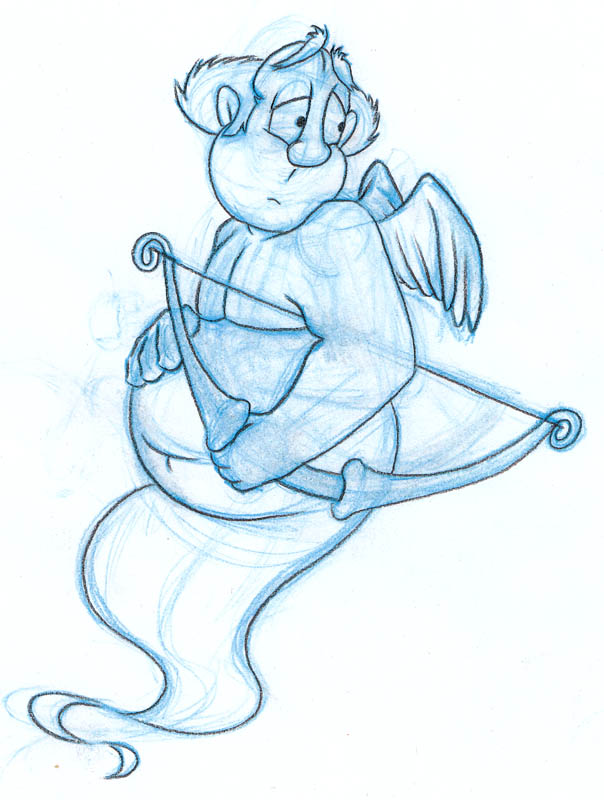
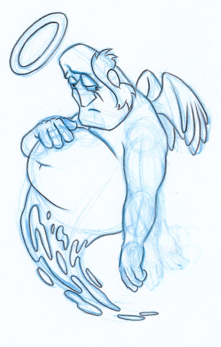
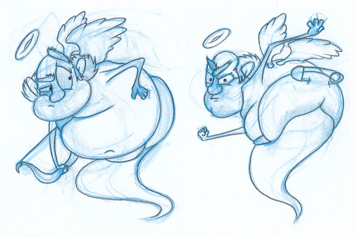
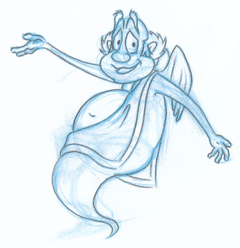
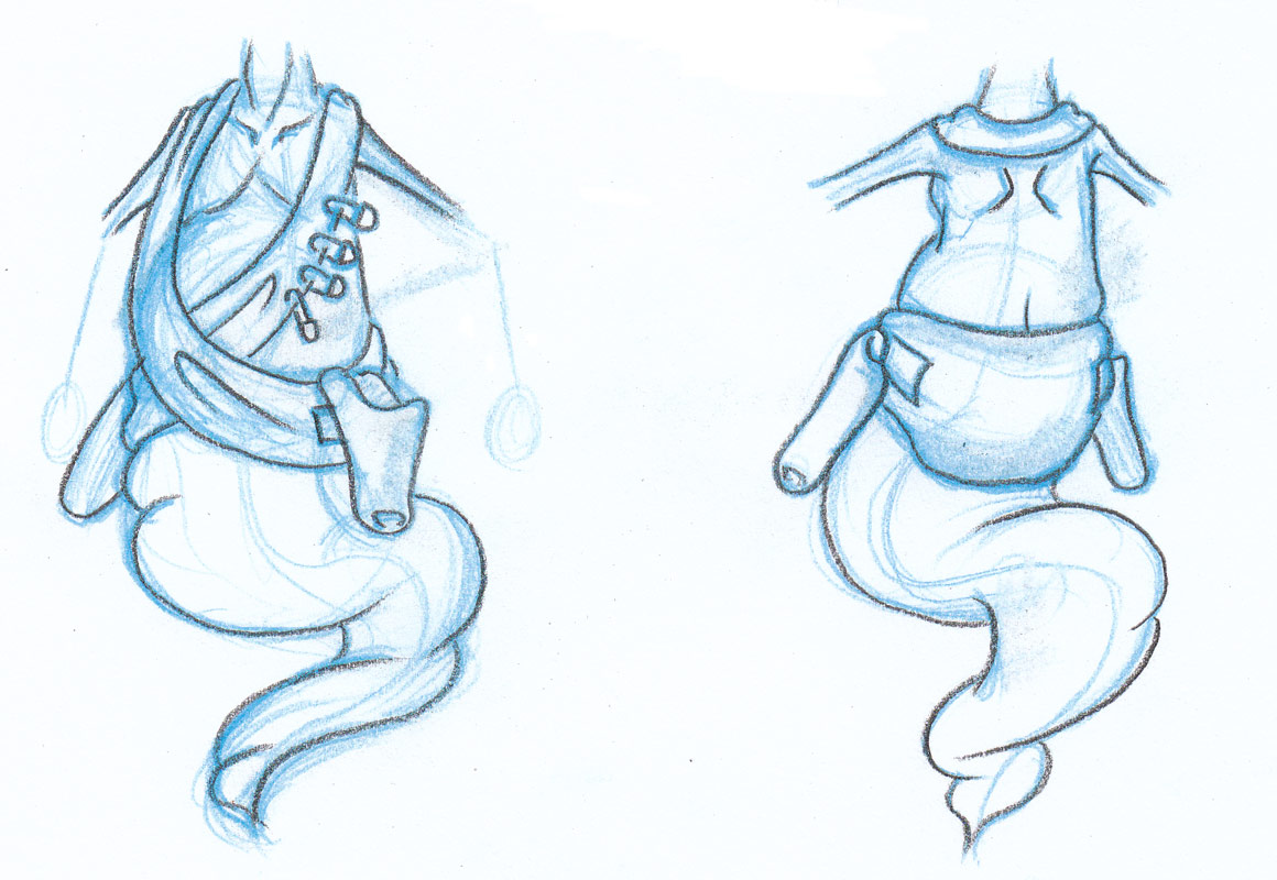
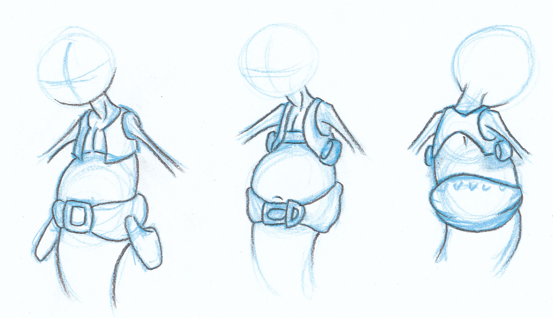
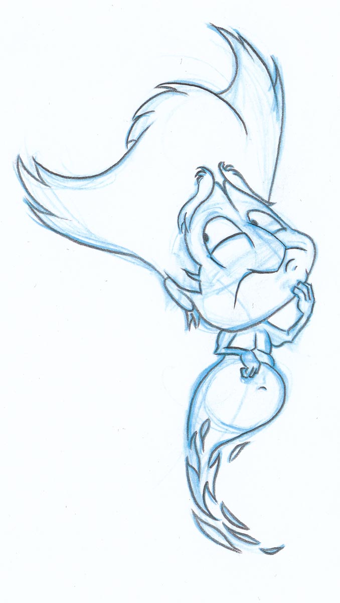
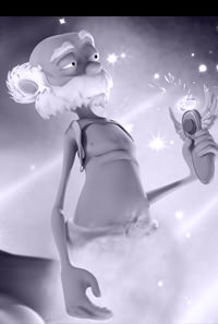
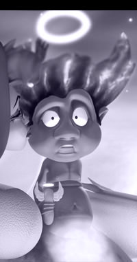
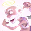
Cupid
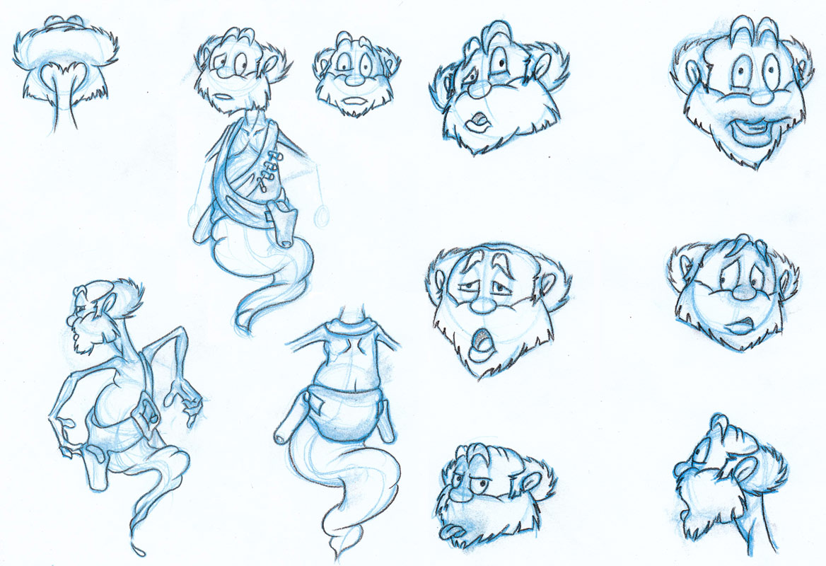
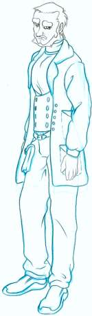
The first design for Cupid, the other lead character in 'Devils, Angels & Dating', was very different to the end design. I imagined him to have an Australian accent or something similar. Cupid's role in the story has changed somewhat from the earlier drafts so he's shifted from a sly leering salesman to a likable old man. But deep down he's a lonely soul and isn't very good at hiding it any more, to the point that he's gotten a little too friendly with the Devil. Unfortunately he's also a bit gullible so who knows where that could lead! Finally Cupid's design was slimmed down a little to make him less of a "Jolly old soul" and more of a wirey old man who can move quickly if needed. |
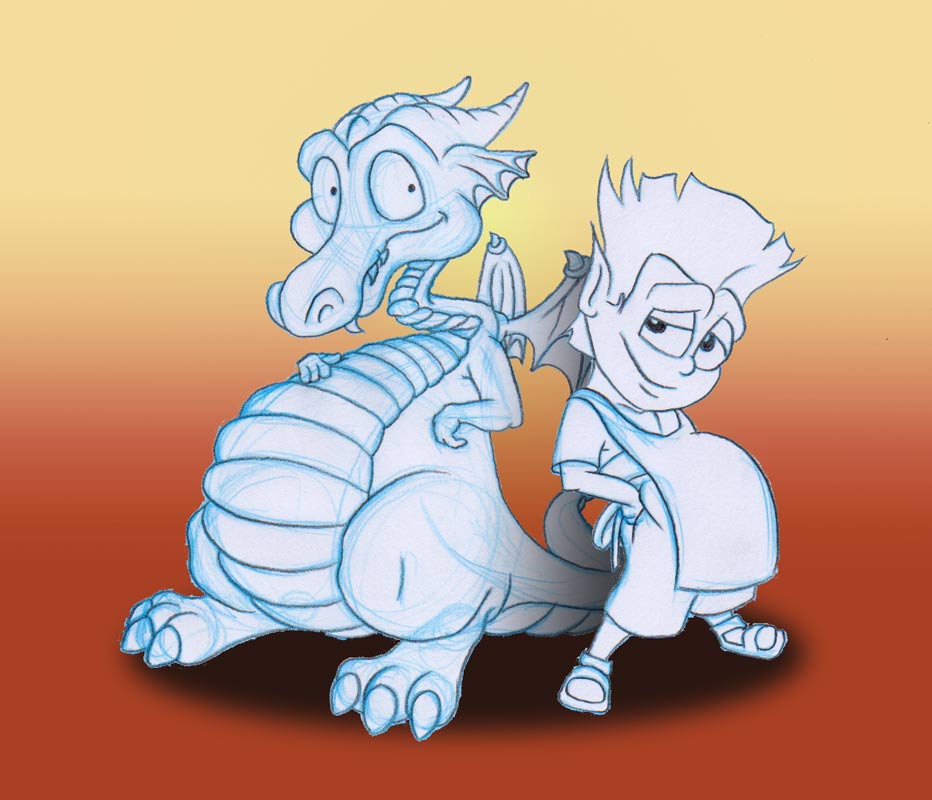
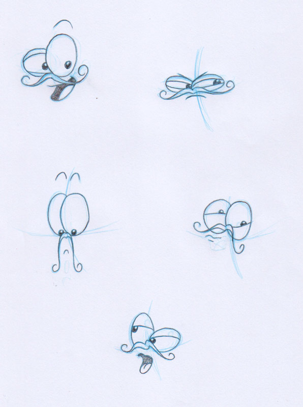
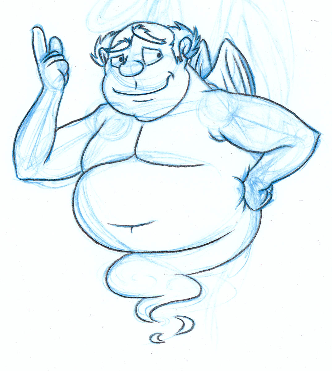
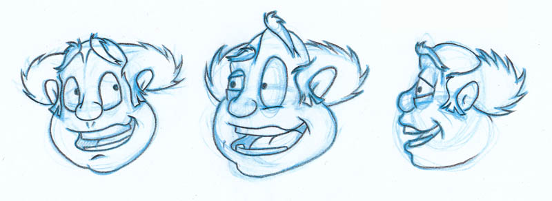
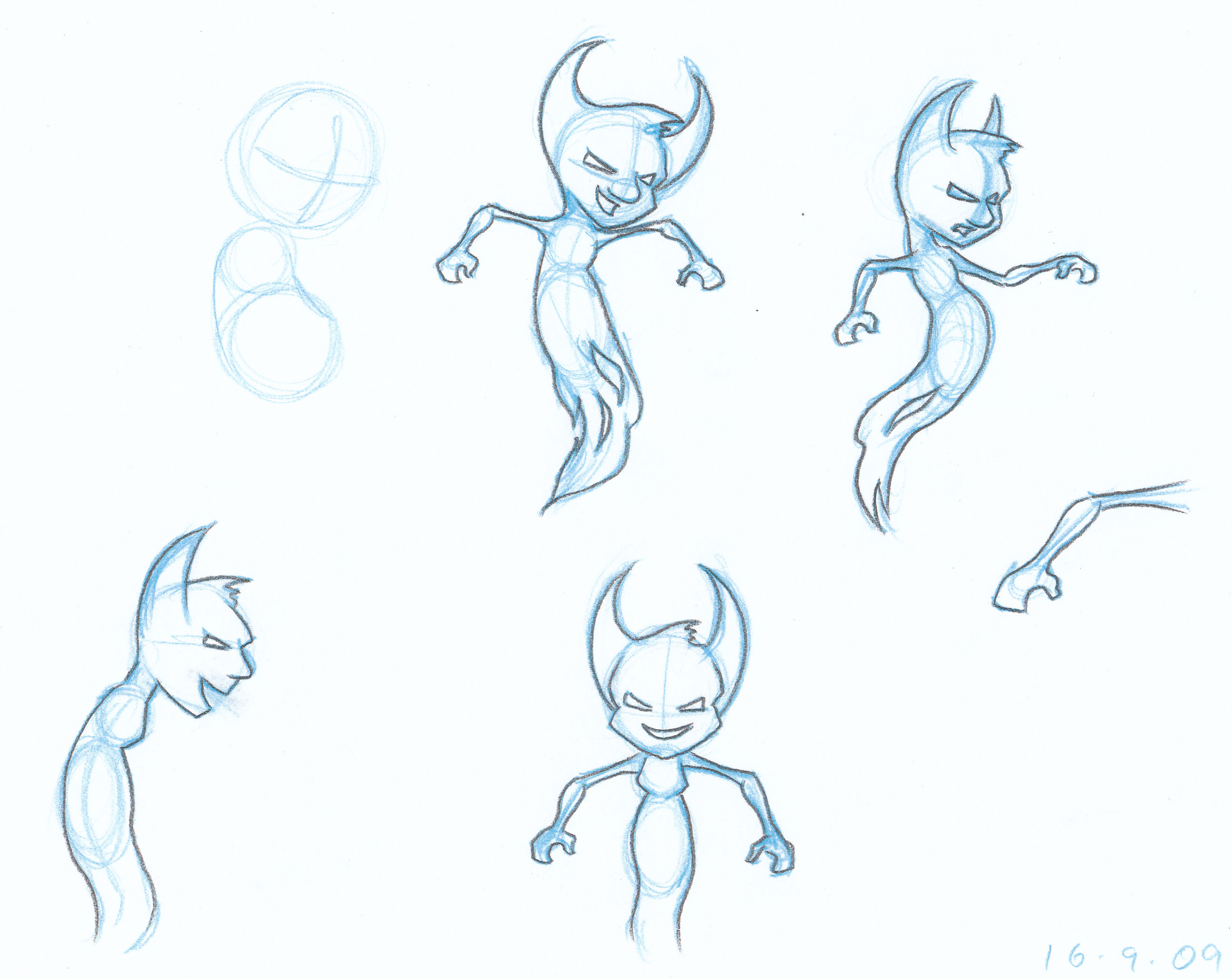
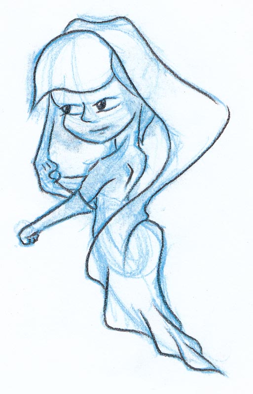
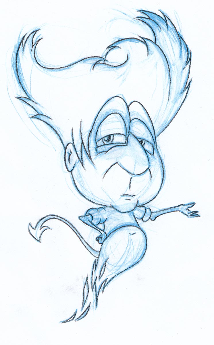
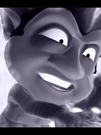
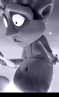
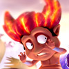
Devil
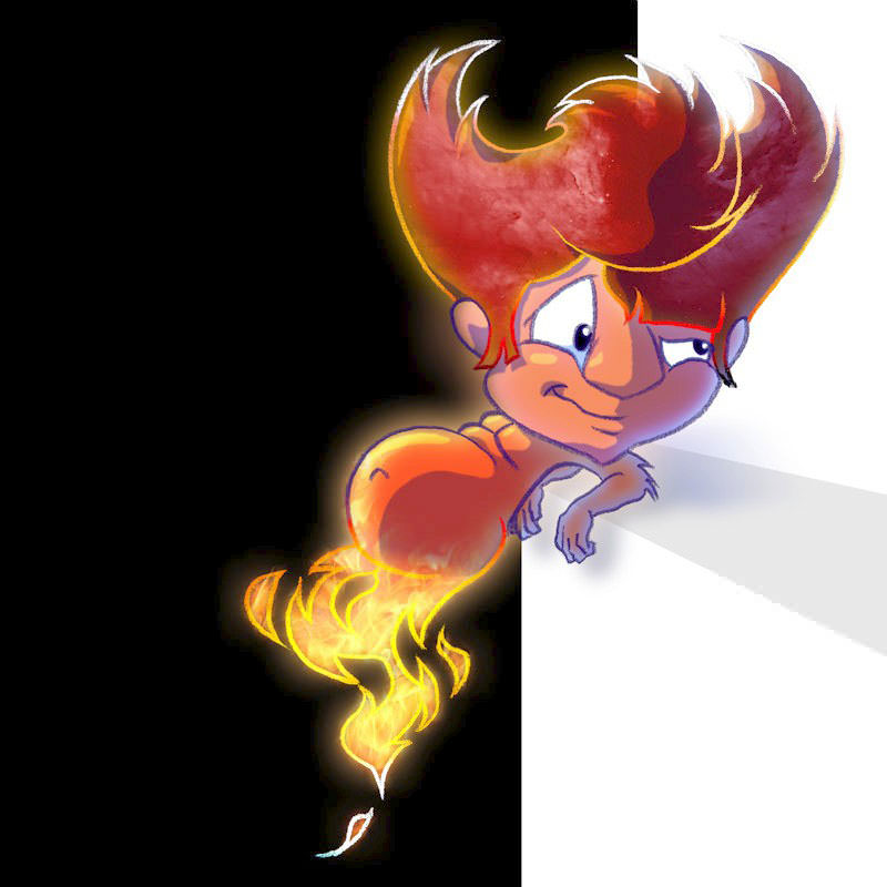
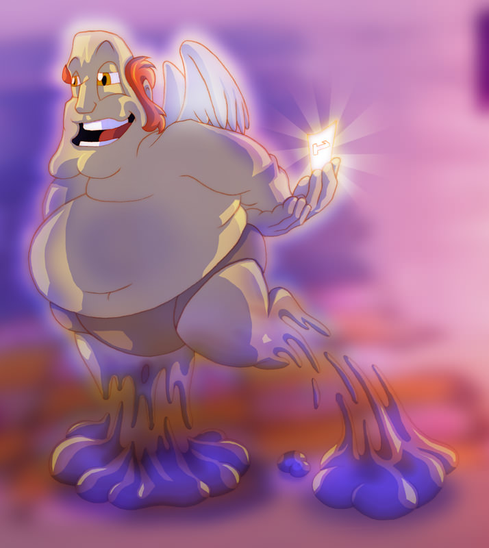
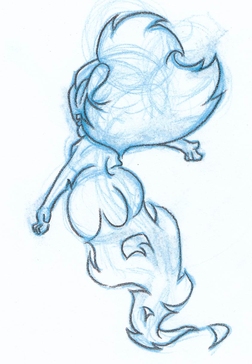
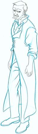
Devil started out as a teenage centre piece for my CG Short Film, when I dropped the Doorman Character. He's now become a cute devil, and he's designed to stand opposite an older Cupid. I didn't want him to have the obvious horns, so I worked his hair into a horn shape instead. Unlimately his hair and his face was desinged to form the silhouette of a heart so that he subliminally projects the theme of the film. |
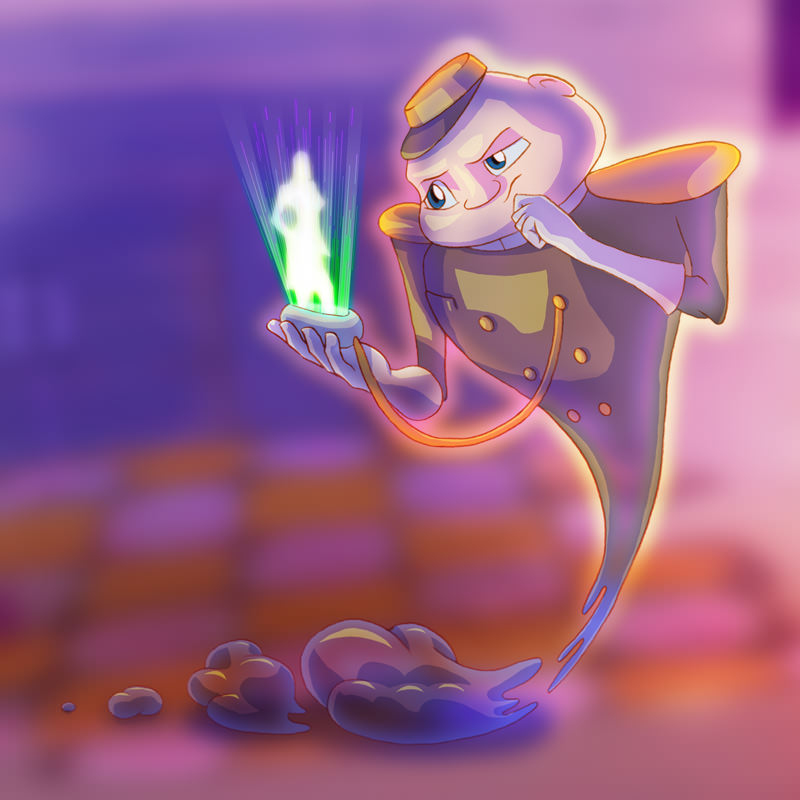
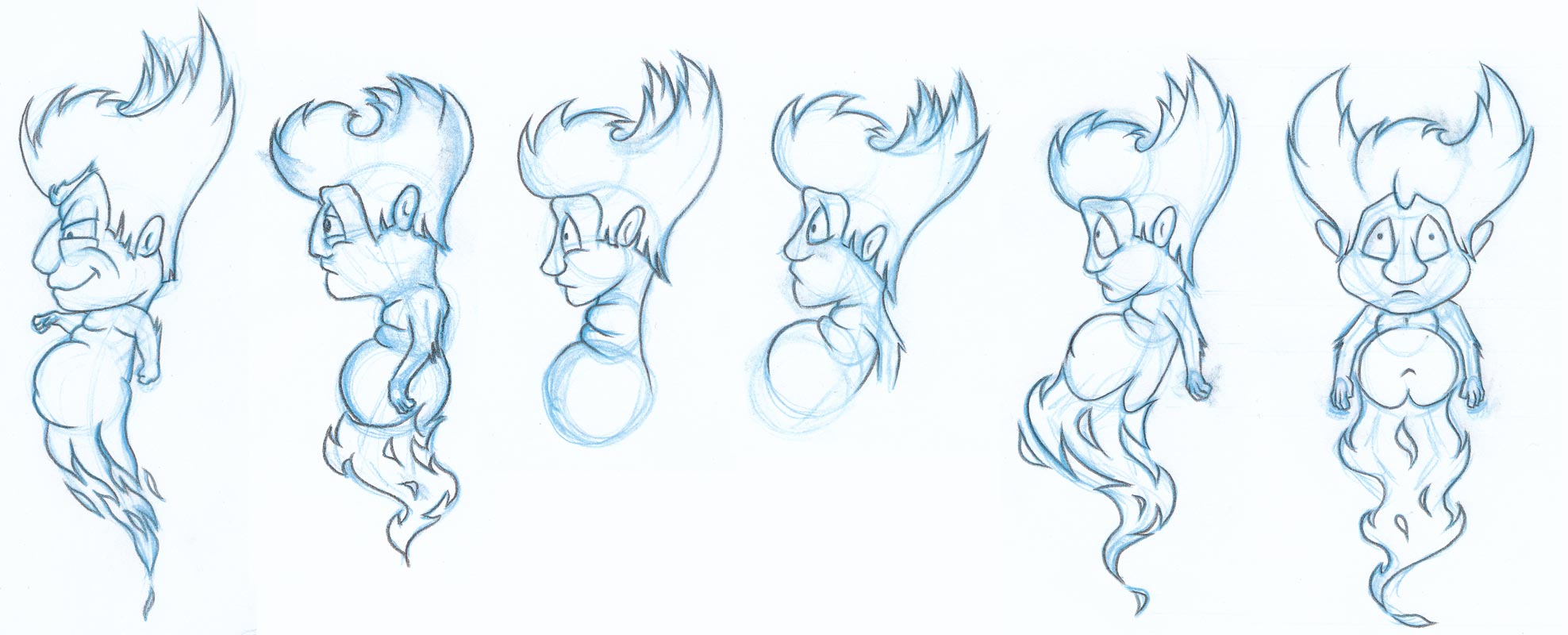
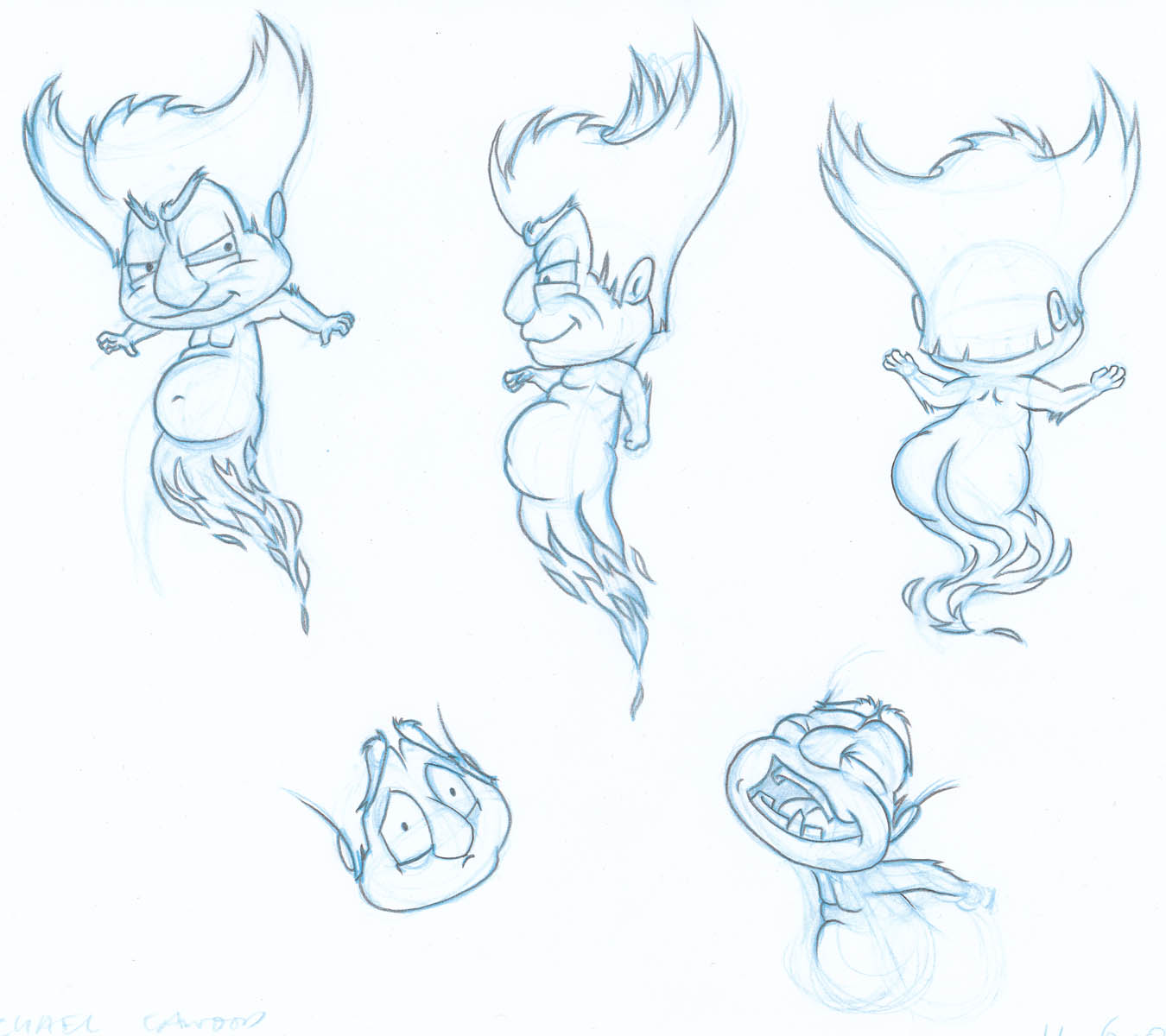
Doorman
Once I started trying designs with the bottom of the character trailing off to smoke, it was time to do some proof of concept technology style tests to ensure that I wasn't designing something that couldn't be produced in CG. You can see the first few tests here. This is a character that has since been dropped from the story of my latest short film project, currently titled 'Devils, Angels & Dating'. |
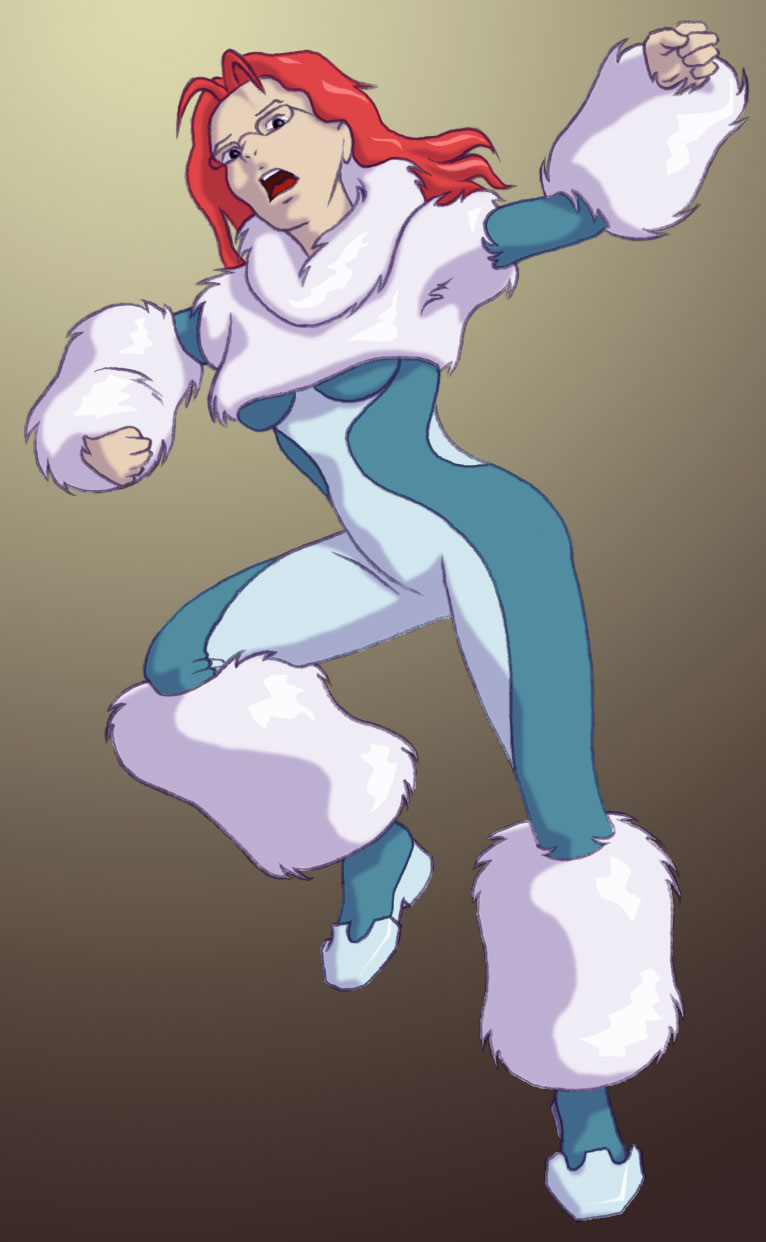
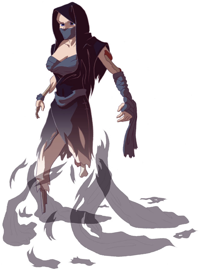
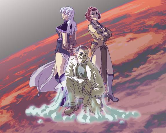
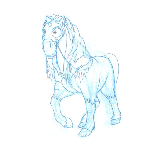
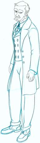
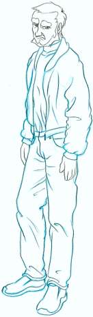
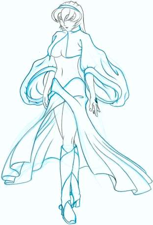
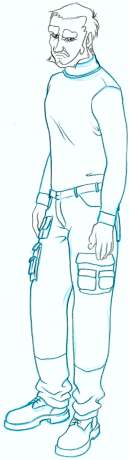
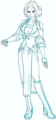
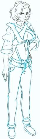
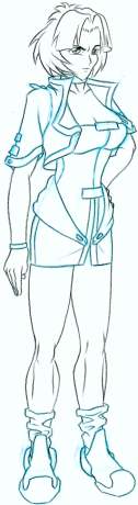
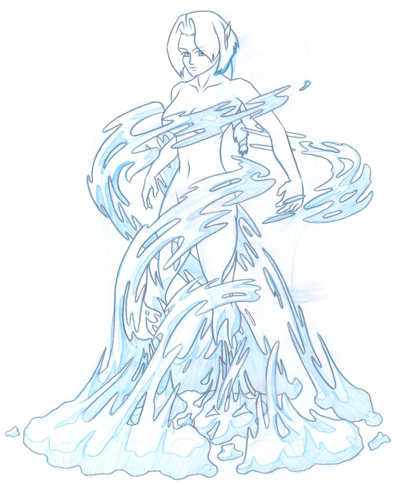
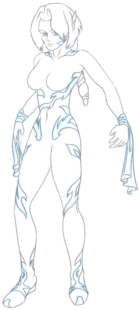
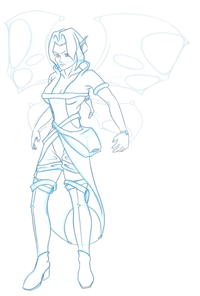
Velcro, Jayscott and SatinI always wanted to work on realistic human characters but I had to get my drawing skills up to that level first. Regardless, I started on the story anyway. I spent some time practicing constructing human figures from all angles in all body shapes. Once I’d gotten the knack of drawing male and female figures naked I settled on a design for each of the key characters (more or less) and worked on a number of costume changes to suit the story. |
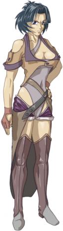
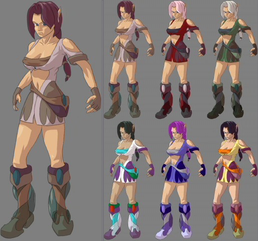
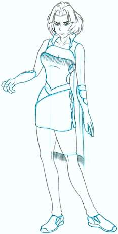
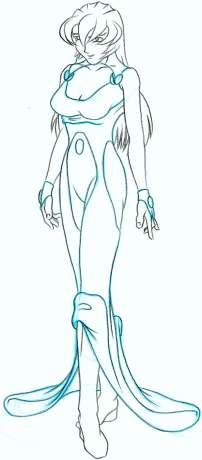
KameoDuring one of the redesign periods for Kameo I had a go and presented a number of colour alternatives. The goal of the design was to make her less cartoony and much sexier. The boots include a billowing veil, the idea being to make the bottom of the legs look big, which grounds the character better in a third person adventure game. |
ThornThe final Boss from ‘Kameo: Elements of Power’. Eerily close to Fenrir from my student film ‘Two Face Tabby’, these sketches of mine were actually based on a design by one of the other artists. I was trying to refine it and pose him for a relevant scene in the story. Unfortunately this design didn’t make it to the final game, it was replaced with something far more clichéd. |
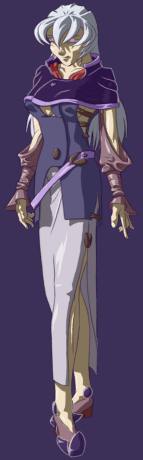
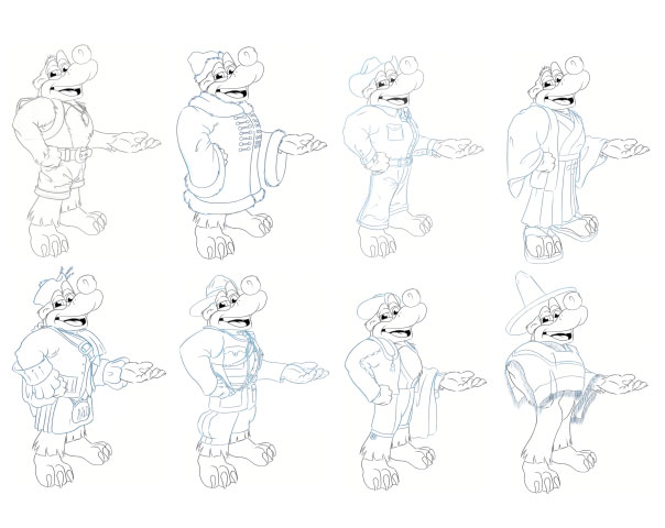
SolonKameo’s father the King and a character that was ultimately never actually seen in the game ‘Kameo: Elements of Power’. He was beginning to feature prominently in the storyboards so in the absence of any character designs I put one together quickly. His costume was designed to fit in with the design motives used in other character’s costumes. |
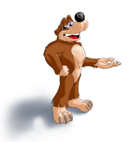
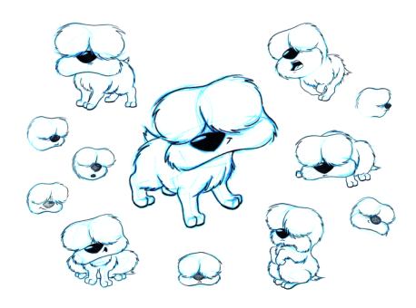
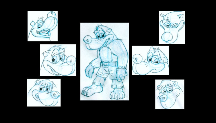
ChesterDeveloped as a mascot for a fabric/fibre cottage industry business. Chester went through a number of dog types and even a few other animals in my pursuit of something that will suit the particular needs of this business. It’s a simple but cute design. Have a look at the website at www.silksacks.co.uk |
FuzzSome doodles I did for a very simple but expressive character. |
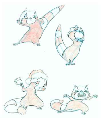
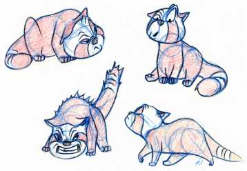
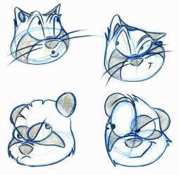
RacketThe Red Panda from "Panda Pander". This little guy was a joy to animate. He’s so pent-up and frustrated that he tends to pop at the slightest thing. He’s got these tiny hands and feet and a tight face and every action is like a compressed spring. His design evolved from a an earlier version that was a bit more like the real life Red Panda, but his redesign gave me the opportunity to streamline his shape and pull stronger poses with less concern for staying true to his anatomy. He’s become my mascot since then. Even years after finishing the film I still like to draw Racket. He doesn’t really talk but I gave him my voice with some heavy distortions to express his emotions more clearly. I remember the recording sessions with Craig. I was standing on a mattress at 3am in the morning jumping up and down, thrashing out Racket’s actions and making the appropriate sounds into a microphone. Poor Craig had to restrain me from waking the neighbours! |
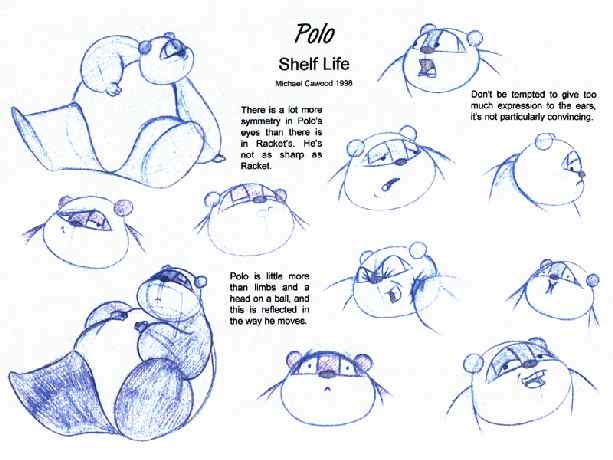
PoloThe Panda from "Panda Pander". Polo existed in another form when he first appeared but that design couldn’t really exist in 3D; it was more of a graphic design. I had problems animating him so I chose to re-design him for Panda Pander. Ultimately even the new design had its problems but he was fun to animate. He’s so cuddly and round that all his actions roll. I’ve got a teddy bear of this character and he's very cuddly! |
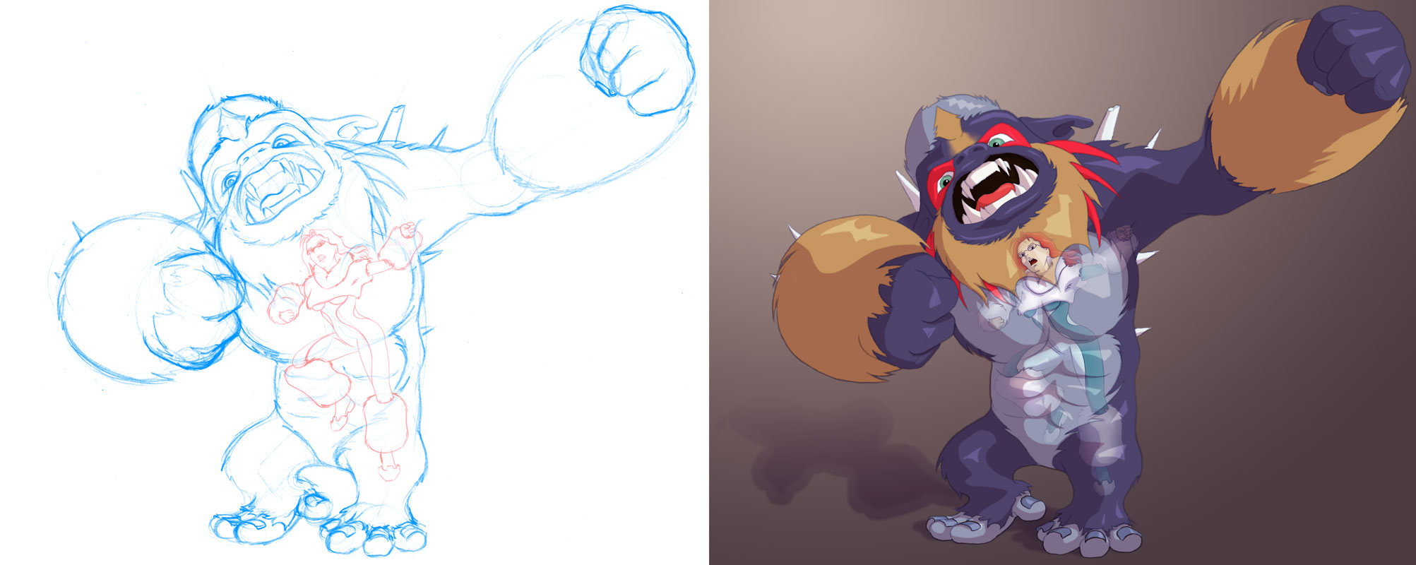
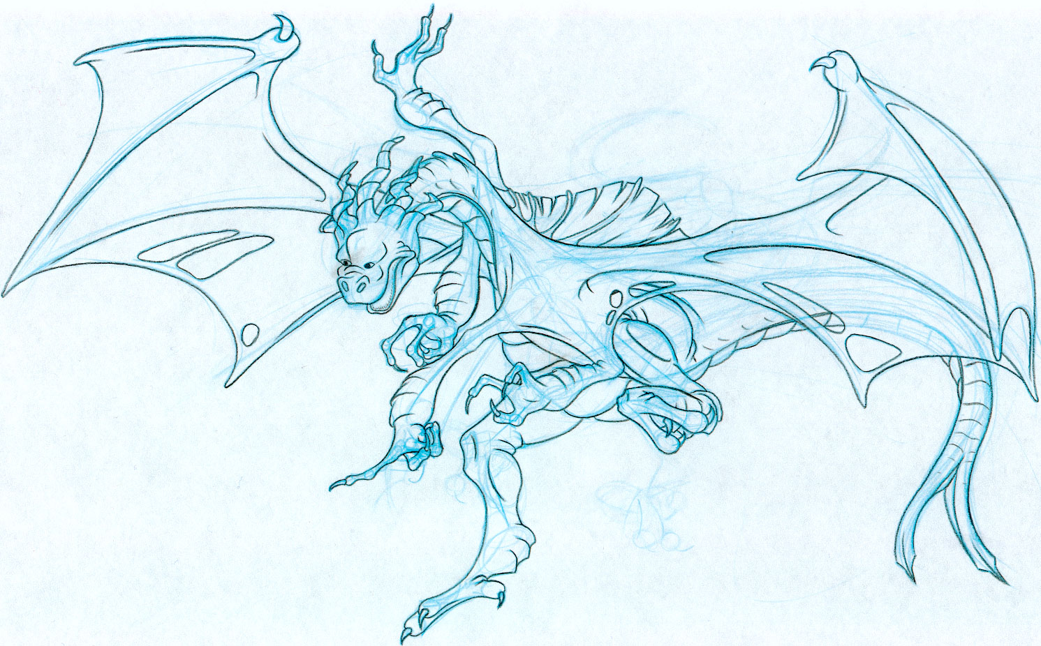
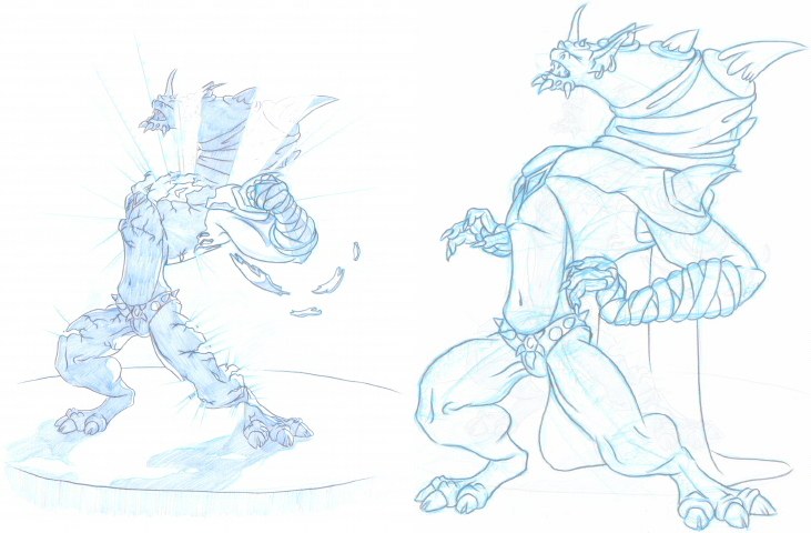
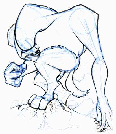
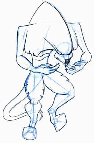
FenrirFrom the film "Two Face Tabby". This guy had to be really cool and really scary; at least that was the plan. I have to admit that I got side tracked and I didn't get the design I really wanted for him, since he ended up being a huge lug of a beast and a real pain to animate. He didn't ultimately get many full figure shots in the film, partly for drama... but mostly because his anatomy was so hard to work with. His chest design was more of a graphic stylisation than a true 3D realisation, so it was a challenge to draw him from all angles. One of the earlier designs was a lot closer to the look I wanted for Fenrir. He would have been more athletic and agile. I wanted him swiftly leaping and contorting around his environment. He should have looked like he could kill viciously in a split second, instead of the lumbering oaf I ended up with. |
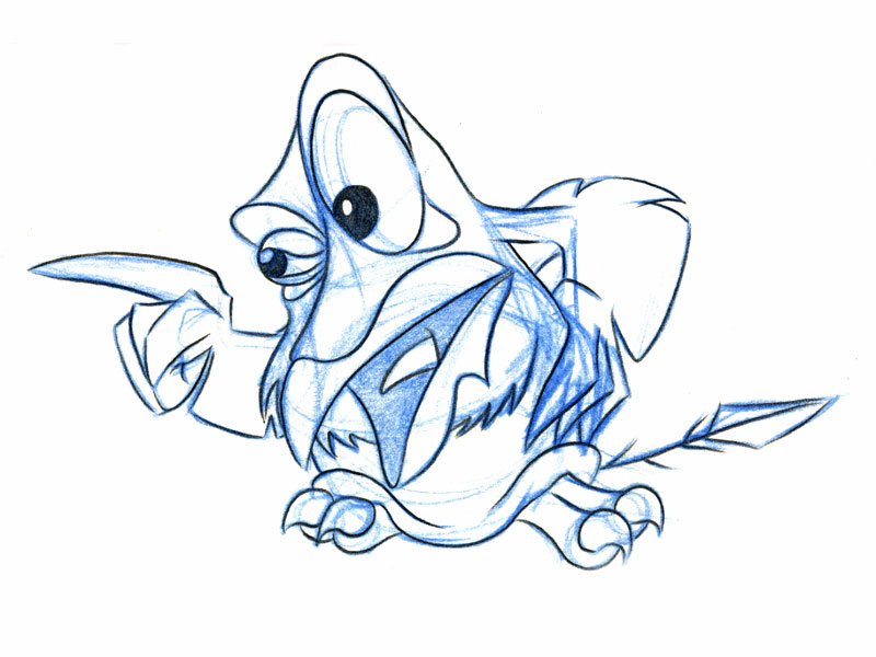
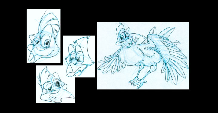
RavenFrom the film "Two Face Tabby". I initially dreaded designing a bird since they tend to have rigid features that you can’t emote with, but this ended up being my favourite character. I went to Bird World (a bird specialist zoo) and drew as much reference as I could get for him. At the end of the day Raven ended up having the strongest character. He was the only one I could really get inside the head of and see what he was really thinking. In hindsight the others were cardboard cut-outs by comparison. He also got a great voice performance from my old buddy, Terry. I only wish I’d given him the starring role and some more lines. |
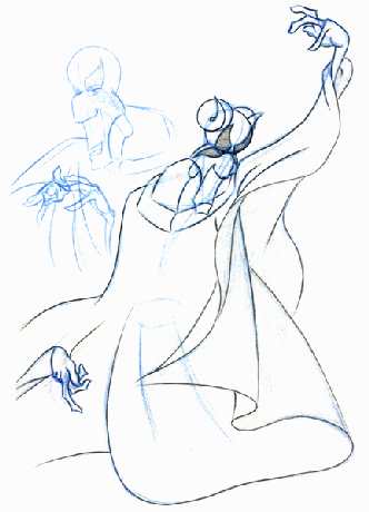
PagenFrom the film "Two Face Tabby". This guy was hard to design. I really wasn’t up to the challenge of doing a human character at this point and even if I was it would have taken me far too long to animate so I had to cut some corners. I decided to cover him in a long flowing costume to avoid the anatomy as much as I could and focus on his face and hands. There is a skeleton in there but it was only needed to provide a loose shape around which to drape the clothes. At the time I was adamant about giving him horns to make him look demonic, but I think he would have looked better bald (there was no way I was going to give him hair – I was planning on finishing this thing!). I ended up voicing him myself, with the pitch pushed way down; I couldn't get what I wanted from anyone else during the casting sessions. |